Journal Entry 3
Feedback
The previous build revealed a few places where the game could benefit from a bit more polish or small tweaks. Players felt that it was strange that the Acrobatic Maneuvers did not rest the leap, especially since it resets the player's jump count, so now it resets that two, effectively acting as if the player has landed on the ground for all intensive proposes. Speaking of the Acrobatic Maneuvers, they two have been changed following the playtesting, players found them to be inconsistent and unresponsive, to combat that the range at which the maneuver will work has been expanded to allow for more room for error.
What’s New
Beyond, what were changes as a result of feedback this build has a plethora of new content, and boasts new visuals and some minor UI elements. I’ll go into more detail regarding some of the more substantial changes/additions below.
UI/Menus
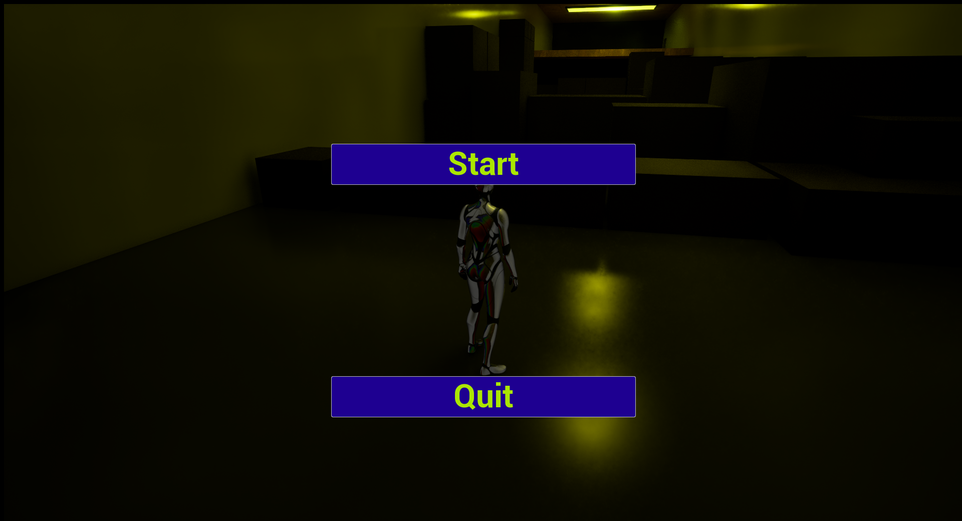
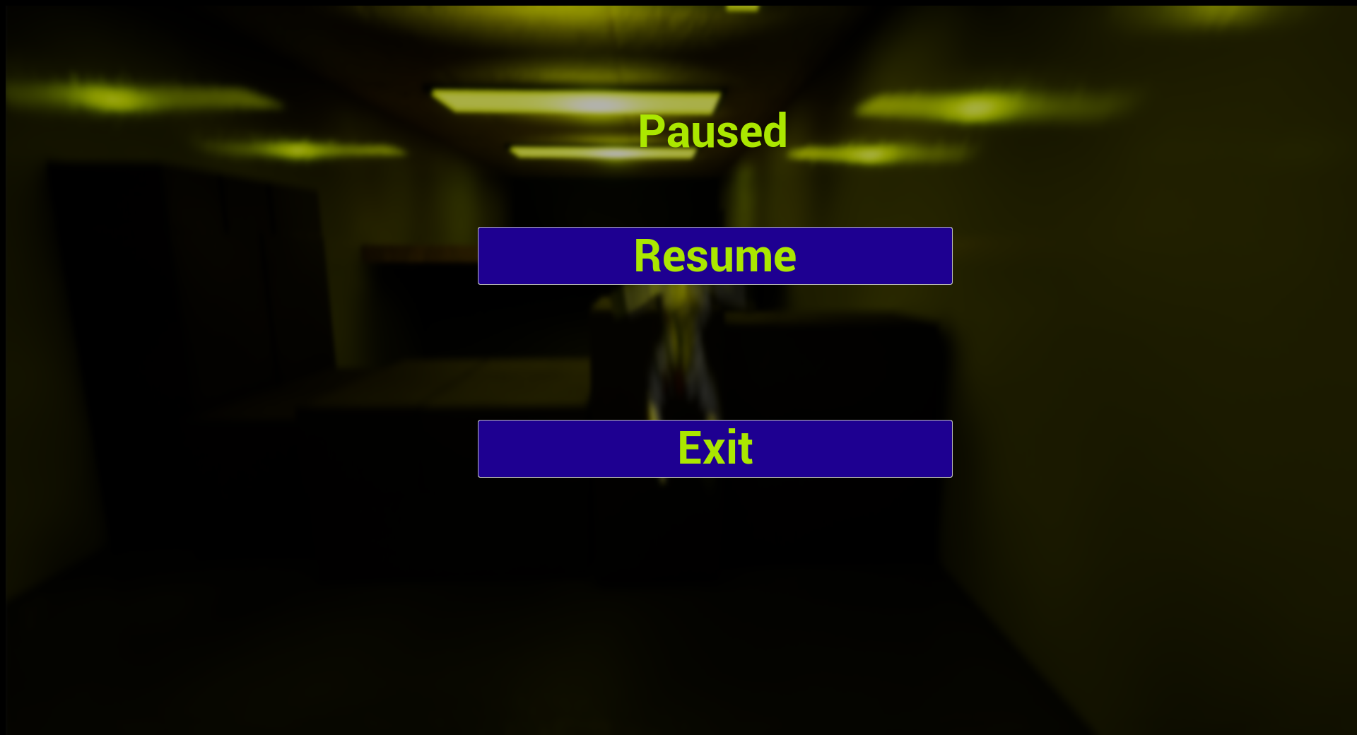
The game now sports an actual menu and even a pause function, this means the game can now actually be closed through in-game means and can be paused or resumed whenever. The UIs accomplishing both of these things are fairly simple at present, but they fulfill their purpose while fitting in well with the color pallet of the game as well as one another.
Visual Update
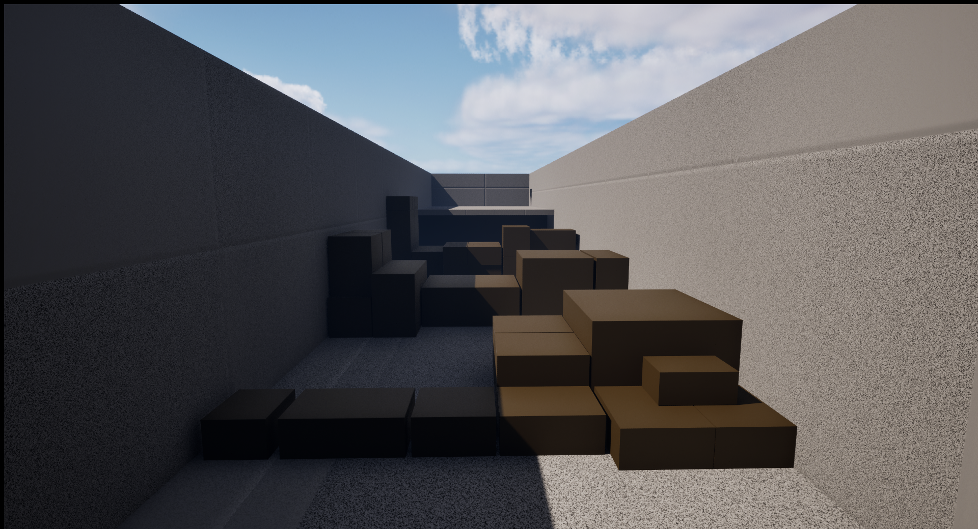
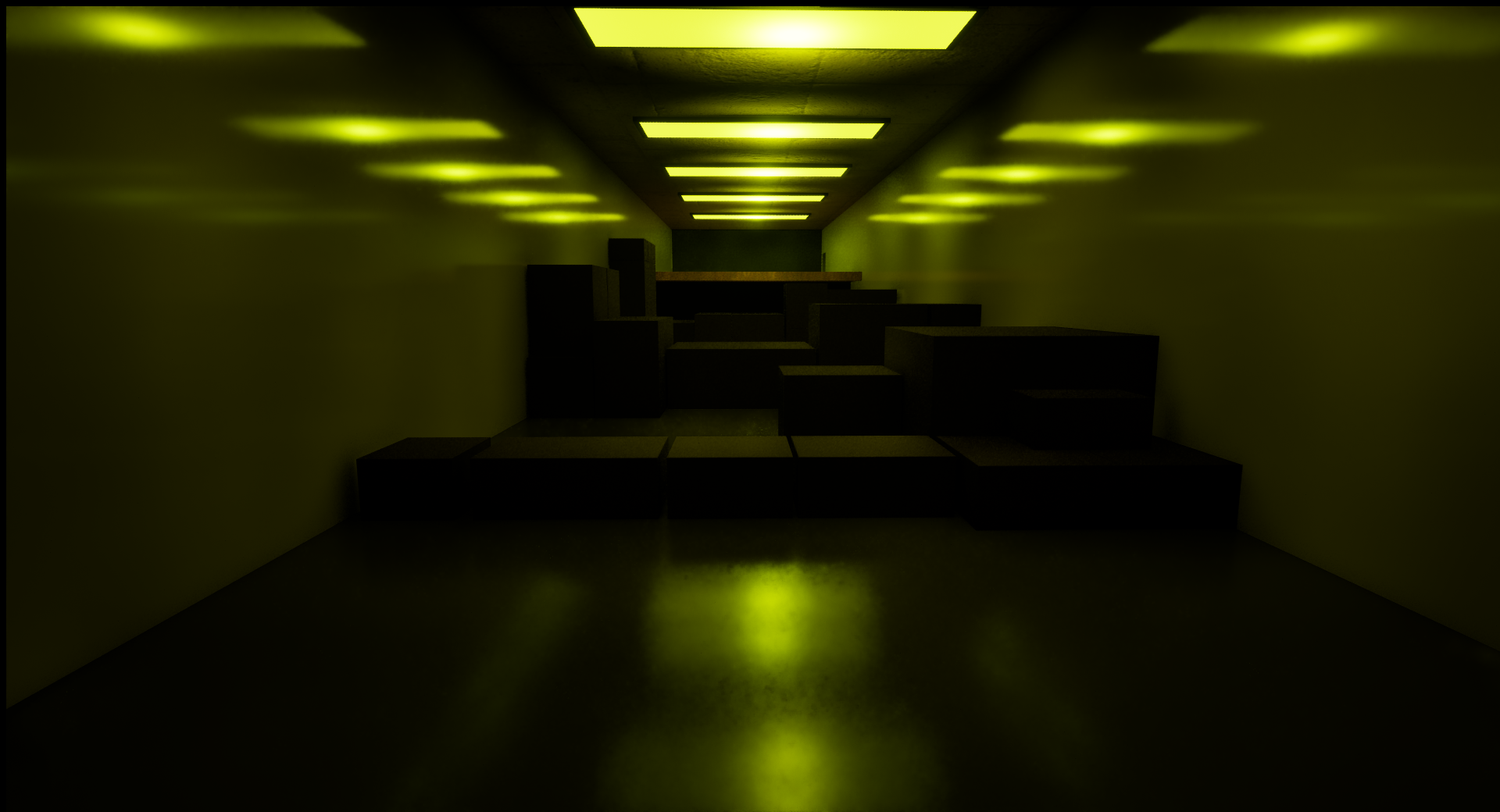
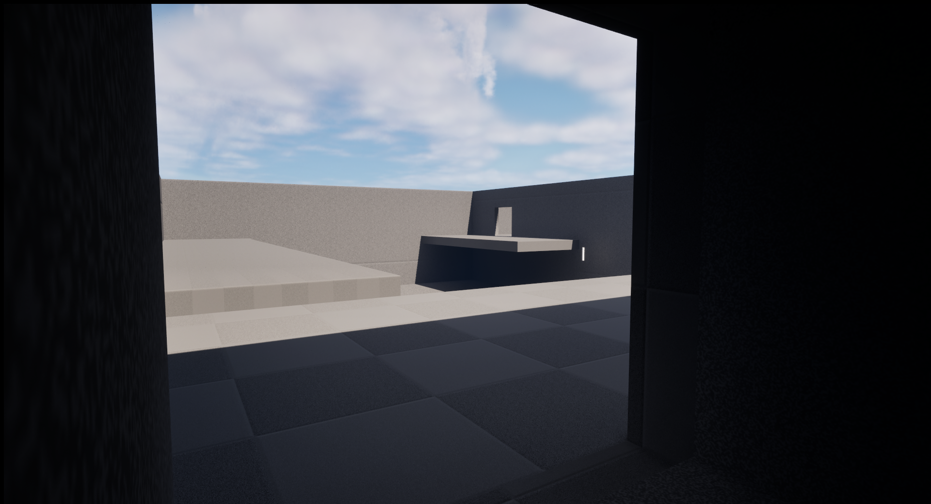
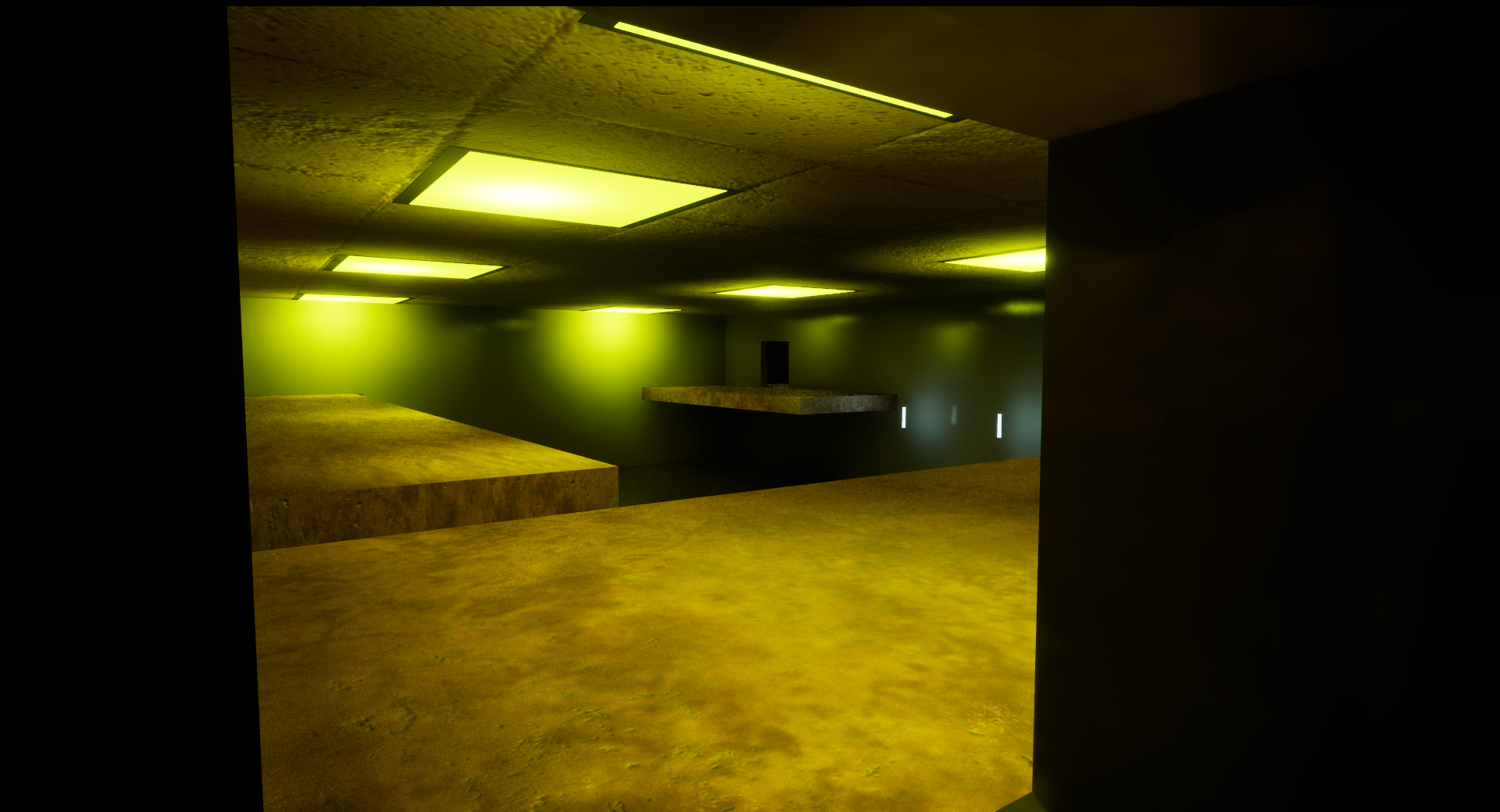
The tutorial level has received a visual overhaul. It no longer uses the default Unreal Engine textures or its default lightning and now more closely resembles what I want the game to look like, at least when compared to its original appearance. The area is still currently not decorated and has received no major changes besides the visual update.
Old
New
Old
New
Old
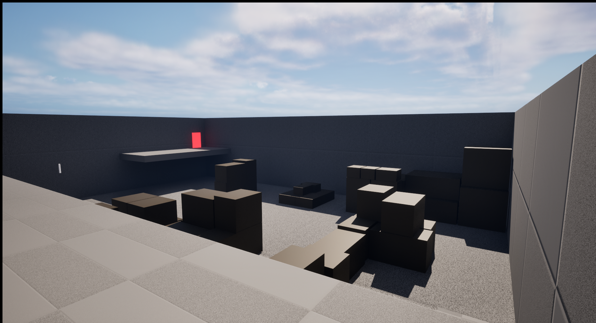
New
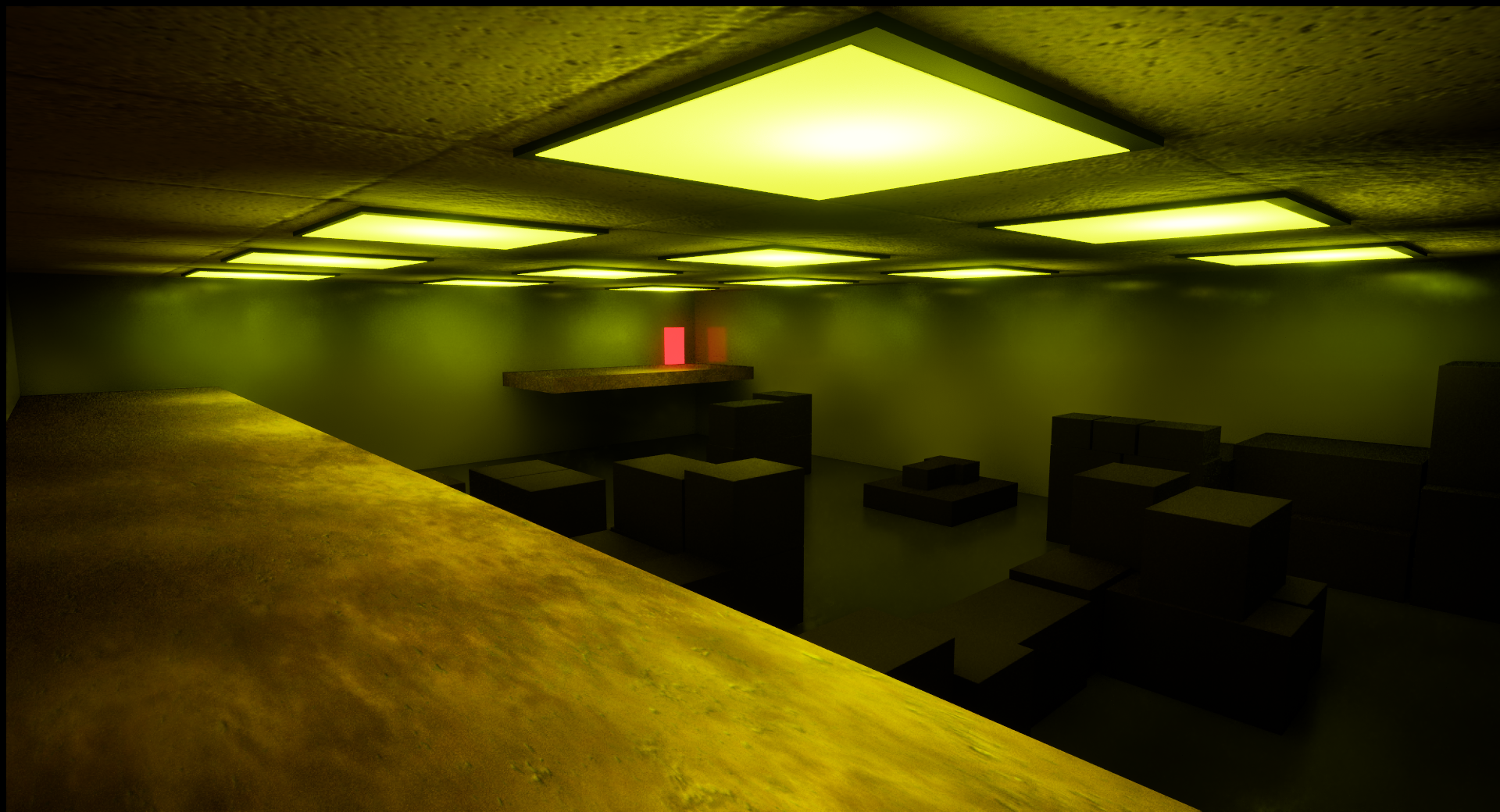
New Level
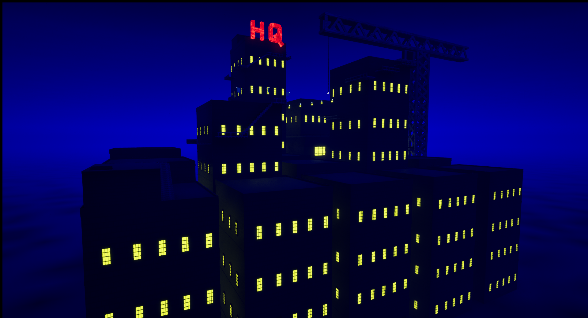
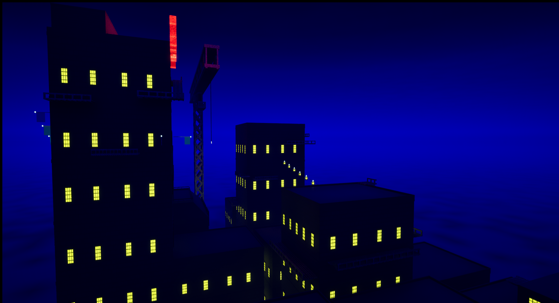
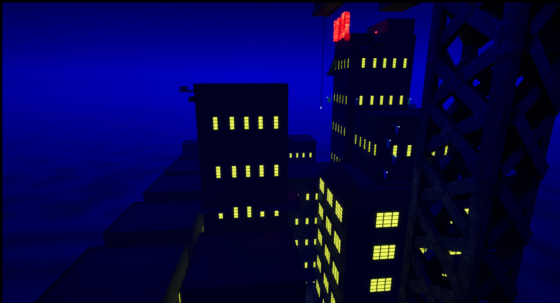
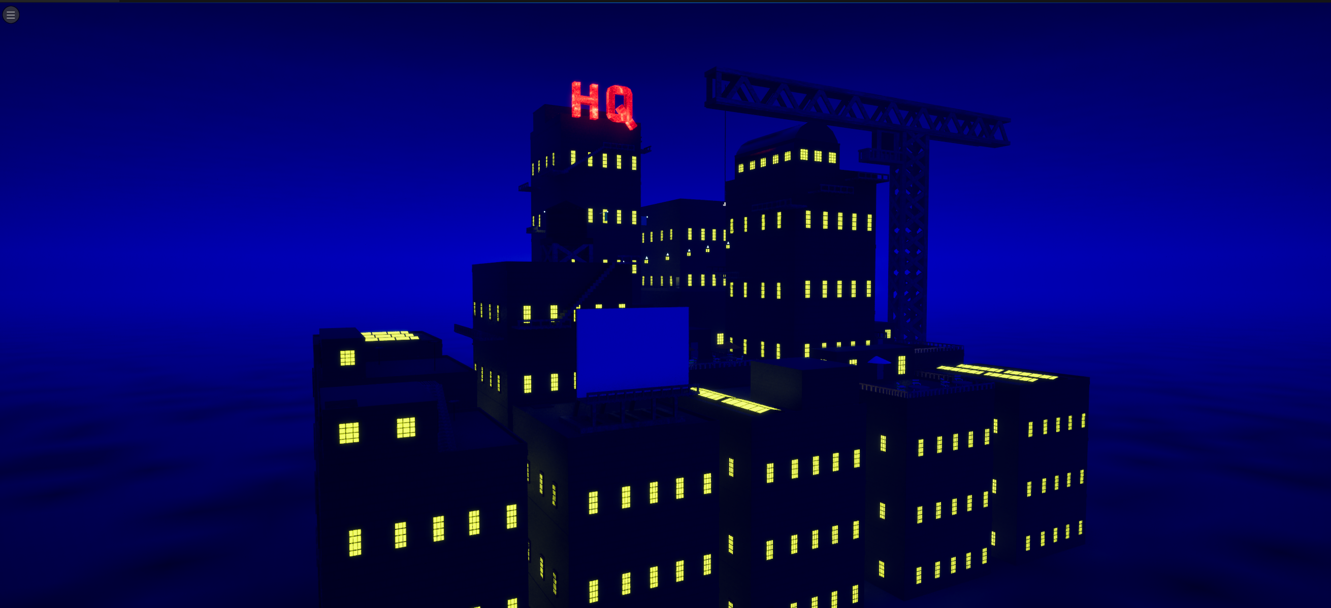
That’s right this build contains a whole new level. This level acts as more of a vertical slice of what the game intends to be. Its visuals, setting, and gameplay align more with the intended core loop of the game than the tutorial which served more as an intro to the game. This level requires the player to reach the top of the HQ and enter the red door to be completed, there are quite a few paths the player can take to reach that endpoint. If I've done everything right, that goal will be clear to any player which will let me leave it to them to figure out how to get there, and with no dead ends the player will always be moving towards that goal naturally as they travel the level. It’s also worth noting that this level introduces a fail state for the player in the form of falling into the fog below. If a player falls they will be forced to start the level over again, so this time there’s a bit more stakes/risk involved in everything. I’m interested in getting feedback regarding this level and expect to be making improvements on it for the next build. As with the tutorial level, keep in mind that while the level is yet to be decorated future builds will expand on that.
Reflection
I had initially intended for this build to be even larger in scope and had planned to implement even more things into this build. But I quickly realized I should scale down a bit, if I hadn't done that I think this build would have ended up bigger but less playable, I would have ended up putting in a bunch of hours into creating a bunch of stuff just for the sake of it existing, with little to no regard as to how it might improve the game or fit into its core loop, or even why I wanted to make any of it in the first place. When I made that realization I shifted my focus to expanding and polishing what I already had and looking at what I've actually managed to accomplish in this build I'm happy with that decision, I've ended up with a build that feels fairly complete and didn't run into any major hurdles when making it.
Get Shadowstep
Shadowstep
Take Back What's Yours.
| Status | Prototype |
| Author | Zengar3D |
| Genre | Platformer |
| Tags | 3D, Singleplayer, Stealth |
More posts
- Journal Entry 2Oct 08, 2024
- Prototyping Journal EntrySep 24, 2024
Leave a comment
Log in with itch.io to leave a comment.